Monday 15 April 2013

Exploring the evolution of Fashion Photography.


I have been interested in fashion photography ever since I first started reading magazines, around seven or eight years ago.
Being the middle-child of five, I’ve always been the quiet one and found it difficult to communicate my thoughts and feelings. However, I soon found a way to express myself through fashion. Fashion appeals to me because there are no wrongs. Although the industry itself revolves around trends, we as individuals can choose whether to accept or reject them. We also have the choice to take a trend and interpret it in our own way. Fashion encourages us to express our creativity and be unique; it helps us celebrate our differences.  To quote Rachel Zoe ‘Style is a way to say who you are without having to speak’.
For my personal study I will be exploring the evolution of fashion photography over a period of great social change. I am interested to see how the genre has changed over the years and who or what influenced the changes.
When conducting my research, I found out that the first Vogue cover to ever have a photograph instead of a drawing was in 1935. Images of fashionable clothes, however, go back to the eighteenth century when images were printed and often hand-coloured. The technique of photography was developed in the 1830’s but it wasn’t until advances in halftone printing came about in the 1880’s that fashion photography started to appear in magazines.  Halftone printing refers to the process of converting different tones into dots of varying size. The first mass printing of fashion photography was in 1856 when photographer Adolphe Braun created a book featuring noblewomen wearing their court clothes.
To help me get started with my study, I searched ‘The history of fashion photography’ which led me to an article that listed numerous photographers that have had a significant influence on the industry. I selected seven photographers and decided to analyse each of their work to see what the differences and similarities are and to see how fashion photography has evolved over the years. I split these seven photographers into three general categories: social realism, fantasy/dream and sexual/erotic. A select few of the images could also be classed as just pure art, simply to be looked at and admired. 

Social realism.

Cecil Beaton.


One of the earliest photographers was Cecil Beaton (1904 – 1980). It is believed that his first photographic experience came from his nanny who owned a Kodak 3A camera and used it to teach him the basics of photography. Beaton would often send his work off to magazines and his big break came when his work was published by Vogue, who took him on regularly in 1927. Alongside working for Vogue and Vanity Fair, Beaton also took photographs of celebrities in Hollywood. It is these particular portraits which caught my attention and they are still published today. 


Beaton photographed a range of widely known influential people such as Winston Churchill, Elizabeth Taylor and Mick Jagger. The majority of these portraits are high contrast and in black and white. The excellent use of chiaroscuro (enhanced by appropriate use of lighting and shadows) makes each tone stand out against each other, creating a bold and eye-catching image. In some images, like the first one, the use of a shallow depth of field keeps the attention on the model and away from the background; this suggests that the background may be irrelevant. The models are central in the images ensuring all focus is on them.
The first and third photos show the models engaging with the audience by using eye contact. This makes the audience feel connected to them, it is like they are giving you an insight into their world. In the first image with Elizabeth Taylor, her facial expression is inviting. Usually, people ask questions and then raise their brows to invite an answer. The raised eyebrow may signal that Taylor is seeking attention. However, they could also signal attraction. With her raised brows and intense eye contact, Taylor implies openness with the audience.
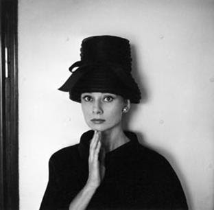
In the top right image with Audrey Hepburn, her wide eyes indicate shock and maybe fear. These emotions are reinforced by her touching her face with her hands to show that she is uncomfortable. She is stationary and not reacting hugely to having her picture taken, this suggests that although she may have been unaware that she was being photographed, she is at ease with the person behind the lens. The audience may feel that they are being shown what Hepburn is really like when she isn’t acting. In contrast to this image is the lastone in which she seems to have taken on a role. The posing and styling in the image reflect the Egyptian queen Nefertiti. Her sculpture is very famous and has been copied as an example of aloof elegance. In this image, Hepburn is posing like Nefertiti and is also wearing a hat similar to one the ‘Royal Wife’ used to wear. Her imitation of Nefertiti suggests superiority and a royal elegance.
The second image shows Hollywood icon Marilyn Monroe looking just out of shot. She has an emerging smile and her facial expression shows awe and admiration. Her dreamy look may be interpreted as romantic, she could be looking at someone she loves.  Her bare shoulders reveal that she is completely in her comfort zone and again reinforce that she may be with her lover.
Beaton really took advantage of the growing interest in celebrity culture and his extensive portfolio gave audiences an insight into the lives of the upper class. This may be one of the reasons why his work is so popular, even to this day. We as a society seem obsessed with celebrity culture and the media strive daily to find out more and more personal information about people in the public eye. They say that ‘a picture is worth a thousand words’ and from looking at portraits you can begin to form an idea about the personality behind the face.
From analysing Beaton’s work, I have learnt that you can reveal plenty about someone’s character using facial expressions and body language. Shots like these are easy to create and I would love to attempt a go myself.

Norman Parkinson.


Another photographer whose work could fall into the category of social realism is Norman Parkinson (1913 – 1990). It is thought that his career began in 1931 when he became an apprentice to a company of court photographers. A few years later, he set up his own studio and was hired by notable fashion magazines such as Harper’s Bazaar and Vogue. His work with Vogue is still widely recognised today. 


Parkinson transformed the fashion photography industry by taking the majority of his most celebrated work outdoors. Most photographers before Parkinson usually used an indoor studio which as you can imagine, was more restricted.
Parkinson had a gift for capturing the true ambience of a particular place. For example, the first shot (featuring his third wife) was taken at Hyde Park Corner and the image has a sense of authentic Englishness with the grey skies and the umbrella reflecting unreliable British weather. Outlines can be seen of a building in the background which reflects the great architecture that London is home to. The passing traffic in the image also imitates the busyness and traffic in the city. London is known as one of the fashion capitals and his wife is seen here wearing a Hardy Amies ensemble.
The fifth image features a New York City background. The couple in the photo are seen running, this along with the passing traffic again creates a busyness and chaos that the city is famous for. The juxtaposition of the couple compared to the skyscrapers makes the buildings look huge, this creates a sense of awe. It positions the audience to feel like they can go to the city and have plenty to explore. The colours of the buildings are also less saturated which makes them appear distant, this reinforces the grand scale of the city. The overall mood of the image evokes a youthful energy and a sense of opportunity. A professional-looking couple are pictured, showing us that Parkinson was open-minded to changes in society that saw more women working alongside men.  Both the London and New York City shots were taken using a soft-focus lens, common in fashion photography. They may be common because they create a softer outline, resulting in a more romantic and desirable image.
Not only did Parkinson revolutionise the taking of fashion photography outside but he also began to experiment with colour photography. Colour photography was still rare at the time because it was much more expensive compared to monochrome and many found it difficult to master indoor lighting in colour images. However, Parkinson did experiment with colour photography and the results were favourable.
The second shot was taken for British Vogue in India, 1956. With it being a fashion shot, the styling is of course elegant, chic and representative of trends at the time. However, the styling is almost overshadowed by the beauty of the photograph. Parkinson had a talent for taking images that appeared to look like paintings and this particular shot evokes a dream-like and romantic quality. Again, it is clear to see the use of a soft-focus lens. Although, he ventured into taking photos in colour, he often stuck to a maximum of three or four colours. This may have been intentional or it may have been because colour photography was not very advanced then.
A feature of Parkinson’s work that really appeals to me is the movement and shapes created in his work. Both the third and sixth images show models creating interesting shapes that really dominate the photo. Even when models are stationary, like in the fourth image, the clothes they wear create shape and add movement and texture. The texture in the images makes them appear more three dimensional. By creating lots of space behind the subject, Parkinson again adds a three dimensional value. This can be seen in all of the selected images.
In comparison to his predecessors (Beaton, Horst P Horst, George Hoyningen – Huene, Edward Jean Steichen) who liked to capture an elite group of people most likely belonging in the upper class, Parkinson wanted to capture women doing everyday tasks such as driving, shopping, attending to children and other such activities. Parkinson reportedly said of the women he photographed ‘I wanted them out in the fields jumping over the haycocks - I did not think they needed their knees bolted together.’

 
From analysing Parkinson’s work, I can see the wonderful effect that comes from utilising a soft-focus lens. This is a technique I am keen to try. 

My attempt


Sunday 14 April 2013

David Bailey.


The final artist whose work I have categorised as social realism is the acclaimed fashion photographer David Bailey (1938 - ). Bailey began work as a photographic assistant and then went onto work with Vogue. His most notable work took place in the 1960’s and the BBC even made a documentary focusing on his 1962 photoshoot with muse Jean Shrimpton. Bailey’s photography helped to capture the vibe of ‘Swinging London’ – an era where fashion and culture really flourished in the capital city. 


Bailey revolutionised the industry by taking photos of elegant-looking women in locations that were less than pristine. This was different to anything previous photographers had done. At the time, there must have been a shock element to Bailey’s photography because no-one had seen anything like it. Bailey was brave enough to challenge stereotypes, this made his work stand-out although I’m sure there were some that felt his work was too controversial or not very tasteful. For example, he photographed women smoking or women out alone in what perhaps may not be the safest of places. Bailey’s work could be seen as a positive movement for gender equality.
The first image shows one of the world’s first supermodels, Jean Shrimpton standing on a NYC street. She herself is dressed elegantly in a trench coat and heels, however her settings are not so aesthetically pleasing. There is a large puddle that dominates the forefront of the image, evoking a grey and gloomy feeling. Bailey cleverly displays the buildings on the street through a reflection in the puddle. In doing this, he shows the location without taking an extreme long shot of the street, therefore Shrimpton can be a focal point and be clearly visible to the audience.
In the second image, we see Shrimpton holding a cigarette in her hand. Smoking in that time, was typically a man’s activity so there is no doubt that this would have caused some controversy. The expression on her face is anxious and maybe slightly fearful. The anxiety is reinforced by her biting her thumb. Her facial expression and body language makes the audience wonder why Shrimpton is anxious, the audience are drawn in because she connects with them using eye contact. They are curious and intrigued about her and about her lifestyle.
From analysing Bailey’s work, I can see how effective contrast is, whether that is contrast of colours or the subject and location. Elements that do not complement each other are always eye-catching. I am hoping to take similar shots where maybe the styling of the model does not fit in with the location. 


Sexual/erotic.

Helmut Newton.


Another photographer I discovered is Helmut Newton (1920 – 2004). Many of Newton’s work falls into a sexual/erotic category. The majority of his memorable work dates from 1936 onwards. Like Bailey, Newton also caused scandal through his work. Many images are action shots or stills from a moving situation. His grainy images raise questions concerning respectability, female beauty, and notions of good taste. The female characters sometimes take on what many believe to be masculine traits, this challenges society’s notions of what a woman should dress and behave like. 


The first and fourth images show women displaying their physical strength and promotes violence. This must have been shocking for the public to see because during that time men and women still very much stuck to their stereotypical roles, with men being physically strong and courageous and women being vulnerable and passive.
In the last image, the model has a cigarette and smoking again was very much a man’s activity.
In the top image, we see a female model dressed up in masculine clothes. This implies that she has taken on what would be considered typically masculine qualities, such as dominance. She appears confident and in control.
Newton is making a clear point that anything that men can do, women can also do. However, in contrast to this is the top middle image. This photo shows women being used for a man’s sexual pleasure. Perhaps, Newton believed that women could be independent and strong like men but still look attractive and feminine. This is reinforced in most of his images because even when women are displaying power and physical strength, they still look sexual and attractive.
The fact that the models in the photos lack eye contact with the camera suggest that Newton is not interested in the particular individual but is trying to make a statement about women in general.
Newton’s photos are eye-catching because they are sexual, the women in them are attractive and this makes the audience want to look at them. His work definitely encourages Laura Mulvey’s male gaze theory.
At the time Newton was working, women had gained equal rights to vote and the battle for gender equality was well under way. These changes in society are reflected in his work, you can see that women are powerful, confident, strong and making their own decisions.
 
From analysing Newton’s work, I can see the importance of props and styling in photos. The clothes the models wear and the objects around them (for example, a sword) help to show their character. I am keen to take photos that could be classed as sexual/erotic as this is something I have not yet tried. I also like the fact that women’s bodies are celebrated in their natural form and that they can be both strong and sexy. 


My attempt


Fantasy/dream.

Erwin Blumenfeld.


The work of Erwin Blumenfeld (1897 – 1969) could be placed into a category of fantasy/dream. Blumenfeld’s most famous work dates from 1930 onwards. Blumenfeld is renowned for taking more Vogue covers than any of his predecessors as well as his artistic nude portraits. He did a lot of his personal work in black and white, whereas commercial shots for Vogue and Harper’s Bazaar were done in colour. 


Blumenfeld’s fantastic use of chiaroscuro creates a dramatic contrast between dark and light and is eye-catching. Many of his photos have links to surrealism which isn’t surprising considering how popular surrealism was at the time. Blumenfeld varied his work by utilising outdoor space as well taking shots inside a studio. The lack of eye contact and hidden faces in his photos suggest that he wants the focus to be on the clothes/accessories and not on the models. The first four images seem very fashion focused and I assume Blumenfeld was concentrating on advertising the clothes worn.  
The last two images are much racier than some of his other work, especially racy when you consider the era in which they were taken.
From analysing Blumenfeld’s work, I can the effect that increased contrast has on an image. This is something that I definitely want to try with my own photos. 

My attempt:


Richard Avedon.


Another photographer whose work falls into the fantasy/dream category is Richard Avedon (1923 – 2004). Avedon’s photography career started in the early 1940’s and by 1946 he had set up his own studio. He produced work for Harper’s Bazaar and Vogue as well as other publications. 


Avedon did not follow the typical route of capturing stationary models, instead choosing to capture movement and action. His images were full of expression and emotion, something not common at the time. The majority of his images were done in black and white and he is one of few fashion photographers of the time who really explored digital manipulation. Avedon started off taking photos outdoors but was not satisfied with daylight so opted to take most of his later work inside a studio.
The first image captures a woman in mid-air hopping from the pavement. The narrow depth of field ensures that all focus is on her. The woman’s body language contrasts against her hopping because usually when you hop or jump, your body is loose, whereas she seems to be completely in control and still manages to look elegant.
The second image is particularly memorable and shows Avedon utilising digital manipulation. It shows Audrey Hepburn in five different positions displaying different expressions. Her body has been edited over by a black paint effect, ensuring that the focus is on her face. The image is unusual and eye-catching, so unusual it’s almost humourous.
The third image has an element of shock as it’s unusual and unexpected to see a woman posing in such a way with elephants. There is also a sense of grandeur as the elephants are much larger than she is and heighten how small she is. The fact that the model seems completely unafraid of the wild animals suggests that she is powerful and in control. She seems to fit in with the elephants and be in sync with them, suggesting she herself may have a wild side.
The fourth image captures shape and movement fantastically. The curves of the models bodies are balanced with sharp straight elbows and knees and the metallic tones of the clothing worn stand out against the neutral colours. The women in this photo are most definitely dominant and the men seem to be there just to be used as props. Both of the bottom images convey messages that woman are strong, powerful and in control.
From analysing Avedon’s work I can see how extreme digital manipulation can make an image much more eye-catching and unusual.


Javier Vallhonrat.


The final photographer I have researched is Javier Vallhonrat (1953 - ). Vallhonrat studied painting but became widely recognised after shooting for Conde Nast publications.  Vallhonrat’s background in painting is apparent in his photography, with an incredible use of lighting and colours that together create photos that sometimes could be mistaken for paintings. His photos contain a three-dimensional texture that is usually built up in paintings by layering.  As well shooting for magazines such as Vogue and Flair, he also teaches creative photography to University students. 


The three images above are incredibly similar in that the models are all posed in a sensual way with one knee up and their heads tilted back. The images evoke sensuality but the softness in the colours and lighting prevents them from being overdone.
From analysing his work, I can see that colours do not need to be bright and lighting does not need to be overexposed to create a bold and eye-catching image.

Comparing and contrasting.


From looking at all of the photographers I have chosen, it is clear to see changes in techniques, subject matter, form and mood happening over time. For example, Beaton was one of the earliest photographers I studied and overall his work is very simple with regards to subject matter and composition. The images I chose to look at feature one model in the centre of the image and an uncomplicated setting. The work of Blumenfeld was published a few years later but is very different. Blumenfeld’s work has been edited in a more apparent way unlike Beaton’s which looks more natural. One aspect that both photographers share is their excellent use of chiaroscuro. 

Cecil Beaton and his use of chiaroscuro.

Erwin Blumenfeld and his use of chiaroscuro.
Cecil Beaton and his natural-looking editing.
Erwin Blumenfeld and his distinguished editing.

Blumenfeld and Parkinson were active around the same time (1930’s) and just as Blumenfeld changed fashion photography by creating pieces that were very obviously edited, Parkinson changed the industry also by deciding to shoot most of his images outside of the studio. By leaving the restrictions of a studio behind, Parkinson was able to reveal more thought and detail through the setting. The setting also helped to make audiences aware of the context. 

Erwin Blumenfeld and an image taken in a studio.

Norman Parkinson and an image taken outdoors.

Newton’s most memorable work dates from 1936 onwards and, compared to earlier photographers, contains more of a sexual/erotic theme. This could signify a change in society’s attitudes. The women that appear in Parkinson’s photos are the epitome of femininity with their full skirts and elegant poses, whereas the women in Newton’s work are strong, dominant and dressed in a masculine manner. 


The model in Norman Parkinson's photo is dressed very feminine. 

The model in Helmut Newton's photo is dressed very masculine.

From 1944 Avedon produced images that were more digitally manipulated than anything his predecessors had created. Earlier photographers usually kept editing quite natural looking but Avedon purposefully created quirky and unusual images, for example the Audrey Hepburn photograph. This particular photo of Hepburn stands out because Avedon shot her in a way that wasn't necessarily attractive, especially compared to Beaton’s images of her which play on her femininity and beauty. 

Richard Avedon's shot of Audrey Hepburn.
Cecil Beaton's shot of Audrey Hepburn.

With so many changes happening within the industry with regard to content and editing techniques, Bailey needed to do something different to stand out. He made his portfolio unique by choosing to shoot elegant and classy looking models in settings that were less than pristine. The contrasts in his images were probably shocking to society at the time because different classes usually stayed segregated. 

David Bailey.

Out of all my selected photographers, Vallhonrat is the most contemporary but his image has the appearance of the more traditional art form of painting. Combined with the traditional painted effect is the modern poses held by the models, they are sensual and erogenous. This combination makes Vallhonrat’s work stand out and appeal to those who are interested in both traditional and modern art. 

Javier Vallhonrat.

As my study shows, many changes have taken place within fashion photography. It is a fast-paced industry which is constantly evolving. Fashion photographers these days must find ways to evolve and come up with new ideas and concepts, either that or they must be incredibly good at taking images in their particular style. It’s exciting to anticipate what kind of photos we’ll be seeing in magazines over the next few years and I am keen to keep experimenting with techniques I have picked up from the photographers I have studied.